Website not converting visitors into customers? Or maybe your business isn’t ranking where you want it to on Google? Perhaps you just want to look at a few ways you can improve your website without spending a fortune.
If you want to get your website into tip top condition, you’re best to pay an expert – but we’re not all made of money. Much as my home would be less of a mess (and more hygienic?) if I paid a professional cleaner, and my meals would be yummier if I hired a chef, getting professional help with everything just isn’t always an option.
That’s why I’m bringing in the experts for you!
I invited four experts in different aspects of websites to share their top tips on what you can actually start to tackle yourself. And these are the kinds of experts it’d be well worth investing your cash in if you do decide to invest in specialist support. Just putting that out there.
These tips are broken down into handy themes to help you work out where best to focus your time, and perhaps your hard-earned cash if you do decide to call on expert help. In the meantime, meet our specialists (they’re all lovely, as well as clever):
The web designer: DAVE SMYTH from Websmyth
The UX specialist: SARAH TJOENG from Dare to Dream Digital
The brand designer: ANDREA BOUGHTON from Beehive Green Design Studio
The SEO specialist: ANDREW COCK-STARKEY from Optimisey
The copywriter: ER… ME (I may have snuck in a few copy tips of my own)
Find out more about each of them (complete with pictures!) at the end of this piece, and find out about me here.
THINK BRAND IDENTITY
Your brand identity is what gets you noticed, recognised and remembered. If your website isn’t converting visitors into customers, polishing up your brand identity could be a brilliant place to start.
HARNESS THE POWER OF A STRONG BRAND IDENTITY
Andrea: Branding should look distinctive and get people excited, but there’s more to it than that! It should also help you get your business to where you want it to be, and that’s why my brand identities are firmly rooted in strategy and industry research.
A smart brand identity also positions your business in the right way, attracting your ideal clients, creating a great first impression, gaining their trust. And of course, getting all that right on your website gives you the edge! The most important thing is to check that you’re using all your brand elements consistently on your website. Consider your brand typeface, colours, logo and any other assets your toolkit, and don’t use different typefaces or colours to design with or you won’t get recognised with a consistent look. Refer back to your brand guidelines if necessary (or think about creating some if you don’t have any – they don’t have to be complicated!).

SHOW SOME PERSONALITY
Me: Personality makes you stand out. Your brand identity makes you look the part, but have a think about how you can extend that character into the way you communicate, too. It can be a really powerful way to engage your audience, build up a rapport and get them desperate to work with your brand!
USE HIGH-QUALITY, ON-BRAND IMAGES
Andrea: Using good-quality, images that fit with your brand can make a real difference (at the very least make sure they’re a sensible resolution for your site and that they fit with your brand colour palette). You’ll get an even better look if you can use images that are unique to you. That might mean commissioning a photoshoot, but with careful planning, you’ll get the shots you need to create the right mood for your brand. They should visually represent your business and service by telling your story, as well as resonate with and engage your target audience. Branded graphics are also great to accentuate your brand and help your website look distinctive.


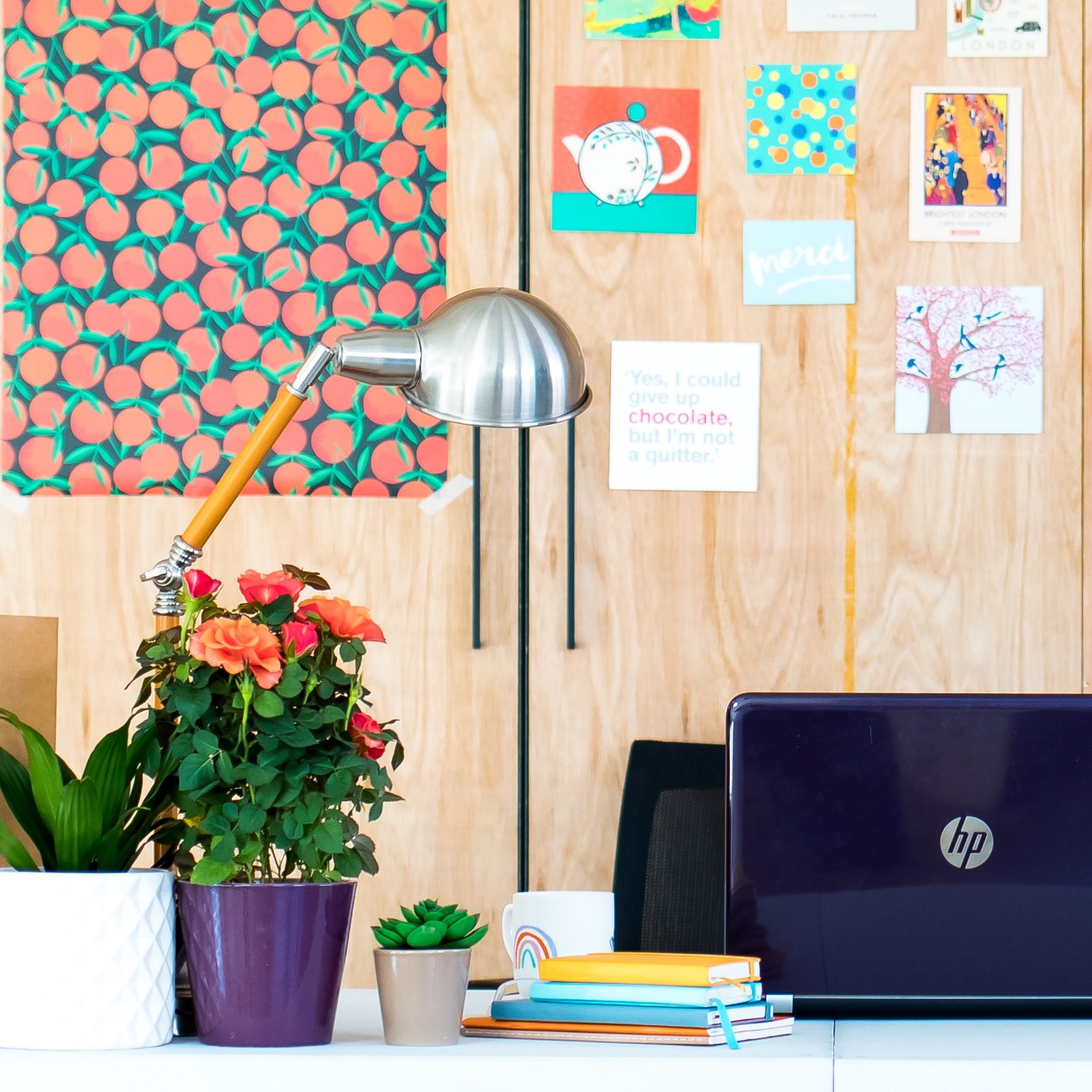
A few of my own brand images
SEARCH ENGINE OPTIMISATION (SEO) – SOME STARTERS
Getting found on Google (or your search engine of choice) is right up there on the list of goals for a lot of businesses. SEO may seem like a mysterious and sometimes murky world of algorithms, tricks and wizardry, but there are simple steps you can take to improve your chances of your website ranking higher.
THINK ABOUT WHO YOUR CUSTOMER IS – IN DETAIL!
Andrew: A great question to ponder is “Who wants to find us?” Too often I find businesses try to compete for really generic search terms like “buy shoes” or even just “shoes”. Those are extremely competitive terms, and they’re also pretty useless. A search for “shoes” could mean horseshoes, shoe repair or shoe polish… not much good if you only sell shoes. When you ask many businesses who their customers are they’ll say “Everyone!” They may mean it (everyone needs shoes, right?) but that doesn’t mean everyone is your customer. My son doesn’t buy his own shoes. Your shop may not want my grandmother as their customer either. Rather than do a half-assed job of targeting “everyone”, do a full-assed one of targeting the people who are your highest value customers. The rest will flow from there.
GET TO KNOW GOOGLE SEARCH CONSOLE
Andrew: Many businesses have set up Google Analytics but haven’t heard of Google Search Console. It used to be called Google Webmaster Tools and was thought of (and probably was!) the exclusive area of “the technical people” or the “web nerds”. It’s packed with useful information about how Google sees (or doesn’t see!) your website. It shows the keywords people search for when your site appears in the results, where you appear in the results (9th, 19th or 90th!), which links Google has picked up on other sites talking about you – and a whole load more. Accessing and using that information can help you improve your site’s search performance no end.
GET THE MOST OUT OF GOOGLE MY BUSINESS
Andrew: Google My Business is often overlooked, but every business should have one – whether you have a ‘bricks and mortar’ premises or not. Google is making a lot of changes to the ‘GMB’ set-up, which is often a sign that it’s interested in the signals that a tool is sending, so make sure your GMB is sending positive signals about your business. Don’t just “set it and forget it”. Instead, update it, use Google Posts, update your office hours for holidays, and add photos. Use it!
TECHNICAL GUBBINS AND BEHIND-THE-SCENES
There’s so much more to your website than what you see on the screen! Take a look at the inner workings of your website and you may feel a bit overwhelmed (I certainly do), but there ARE things you can do to help improve your website’s performance without having a technical expert in tow.
GET TO GRIPS WITH YOUR WEBSITE’S ANALYTICS
Dave: If you feel your site isn’t performing as well as you’d like, the first thing I’d check is your site’s analytics. Ask yourself questions like:
- Are users spending time on the site
- Are they finding the pages that you want them to?
- Where are the majority of visitors coming from?
- If there’s a high bounce rate, are visitors landing on the home page then exiting or are they exiting after reading one of your posts? The bounce rate can mean different things depending on the page.
Analytics should give you some indication of where to focus your improvements!
OPTIMISE YOUR WEBSITE FOR DIFFERENT DEVICES
Dave: Another thing that your website analytics can show you is whether your users are mainly viewing from mobile, desktop or a combination. If your analytics show that your visitors predominantly use a specific type of device (mobile or desktop, for example), have a thorough look at how the site works for that device. You might be able to optimise it further! Oh, and try to avoid using a hamburger (mobile) menu on desktop screen sizes.
Sarah: Yes, those three horizontal stacked lines that we’ve come to recognise on mobile as meaning “menu”, but which are increasingly popping up on desktop. Opinions differ, but personally I think this hinders the experience on desktop for most users. Research shows that only 52% of people over the age of 45 know what those three stacked lines mean, and they’re the ones most likely to be using the desktop. It’s used on mobile to save on space, but there’s plenty of room on the desktop page, so why make it harder for your customer?
CHECK YOUR WEBSITE’S LOADING TIME
Dave: If the bounce for your site is high, check your website’s loading time. Tools like Pingdom and GTmetrix are great for this. Your page size should be under 3MB and the load time should be under 3 seconds on Pingdom (choose London or Europe as the data centre). Page sizes over 3MB are almost always due to large image sizes, so you might want to optimise these with a plugin (on WordPress sites). You may need to re-upload images closer to the size they’re being displayed – if the image is 400px, for instance, don’t upload a 3000px image. This can make a huge impact on the size of the page.
ON PAGE: DESIGN, CONTENT AND OTHER BITS AND BOBS
I said before that there’s more to your website than what you see on the page – but what you see on the page does really matter, too. It needs to look professional, sound professional and work well for your users, otherwise they’ll quickly click away to a site that gives them what they want.
GET BACK TO BASICS WITH YOUR MESSAGING
Me: Think about what your customer wants to know from you, rather than what you want to tell them. It might be that you can find a balance between the two, but remember that ultimately your website needs to do what they want it to, otherwise they’ll navigate away to a competitor. A great way to do this is to imagine yourself into their shoes – or if that’s too hard, ask family and friends what they’d want to see before they made the decision to work with you.
UNDERSTAND ON-PAGE HIERARCHY AND USE IT
Andrea: The size and positioning of words and imagery are important to draw your visitors’ attention to the most important areas of your website first. Hierarchy also adds pace and visual interest to the design. But most of all it’s about communicating clearly.
Sarah: Top tips from me include putting your most important points in the first two paragraphs on the page, using headings and sub-headings to show different sections, formatting important words and phrases so they’re BOLD, grouping content, and using lists or bullet points. Another huge tip is to understand the “F-shape” pattern. “Eye-tracking” of test participants shows that this is the most common path our eyes take when we first land on a website, even on mobile. I’ve seen this time again working at big corporates. Think about this when you’re designing your pages. Of course, all websites and users are different, so don’t use it rigidly. It might be that you have a lot of important content you want the user to look at carefully, so you might actually turn this on its head and not “allow” them to scan in their normal way!
EMBRACE WHITE SPACE!
Andrea: The holy grail of design is the space around design elements. This clear space is far from being wasted space – it’s a powerful design tool! Use it wisely to help items stand out and allow generous line spacing that keeps everything legible.
Nothing to see here… just a bit of white space (move along, please).
NAIL YOUR CALL TO ACTION BUTTONS!
Sarah: These are there mainly to entice people to take a specific action, such as Contact, Buy, Book, Subscribe, Sign up… the list is endless! Used well, a button can immediately attract your customer and get them to take the action you want them to. So, make it big and put it somewhere obvious. The easier it is to spot, the more likely your user is to click it! Also make sure it stands out from its background (if you blur your eyes, the button should be the one thing that stands out), so pick a contrasting colour. And finally, keep the words on the button concise and clear. Think “BUY” rather than “CLICK HERE TO BUY NOW”, or “SUBSCRIBE” rather than “SIGN UP TO MY NEWSLETTER HERE”.
USE TESTIMONIALS TO BACK UP WHAT YOU SAY
Me: Pick out short snippets from your testimonials and use them to reinforce what you’re saying about yourself throughout the site. Hiding longer versions all away on one page is great for a customer who’s at that decision-making stage and wants to check out your reviews in more depth, but they can be a powerful way of building trust with a brand new visitor who’s just landed on your home page, too.

WEBSITE ACCESSIBILITY MATTERS
I struggled a bit with which heading to slot this one under, but in the end I realised it’s all-important, spans all the topics and is just really at the core of making a site that works well for anyone – whoever they are. So it gets its own heading. Take note.
Sarah: Websites should be accessible and inclusive to everyone, and following a few best practice tips can make a big difference.
- Wherever you have content that isn’t text (like an image or a graphic), make sure you add an accompanying text description so that it can be translated for screen readers, Braille readers, symbols or large format.
- Make sure there’s enough contrast, for example between your text and background, or with text over images, so that your content is clear for people with visual difficulties or colour blindness.
- If you have moving elements like banners or carousels, give people plenty of time to read them. Each screen should be visible for at least 8-10 seconds.
- Make the site easy to understand, with clear navigation.
If you found this useful, you might also like to explore the rest of the How To series.
ABOUT THE EXPERTS
The web designer: DAVE SMYTH

London-based web designer and consultant Dave works with individuals, small businesses and start-ups to create websites that enhance their brand. He’s been building websites since 1999, turned freelance in 2013 (find him at Websmyth), and hasn’t looked back. Oh, and he also lectures at City, University of London, runs Work Notes (a website for freelancers), and is the brains behind the Independent Work community. Busy guy.
The UX specialist: SARAH TJOENG

Sarah is a website expert but I asked her to be a part of this specifically because of her background as User Experience Designer. For twelve years she worked with brands like Tesco, Canon, TUI and Barclaycard, and now puts all that experience to use helping small businesses through Dare to Dream Digital.
The brand designer: ANDREA BOUGHTON

Brand consultant and founder of Beehive Green, Andrea knows how smart design can transform a business. With over 20 years’ at London-based agencies as a senior designer and account manager, she launched Beehive Green design studio in 2017 to help small businesses shift their brand to the next level. Web design sits alongside the brand identity and graphic design services Andrea provides to her clients.
The SEO specialist: ANDREW COCK-STARKEY
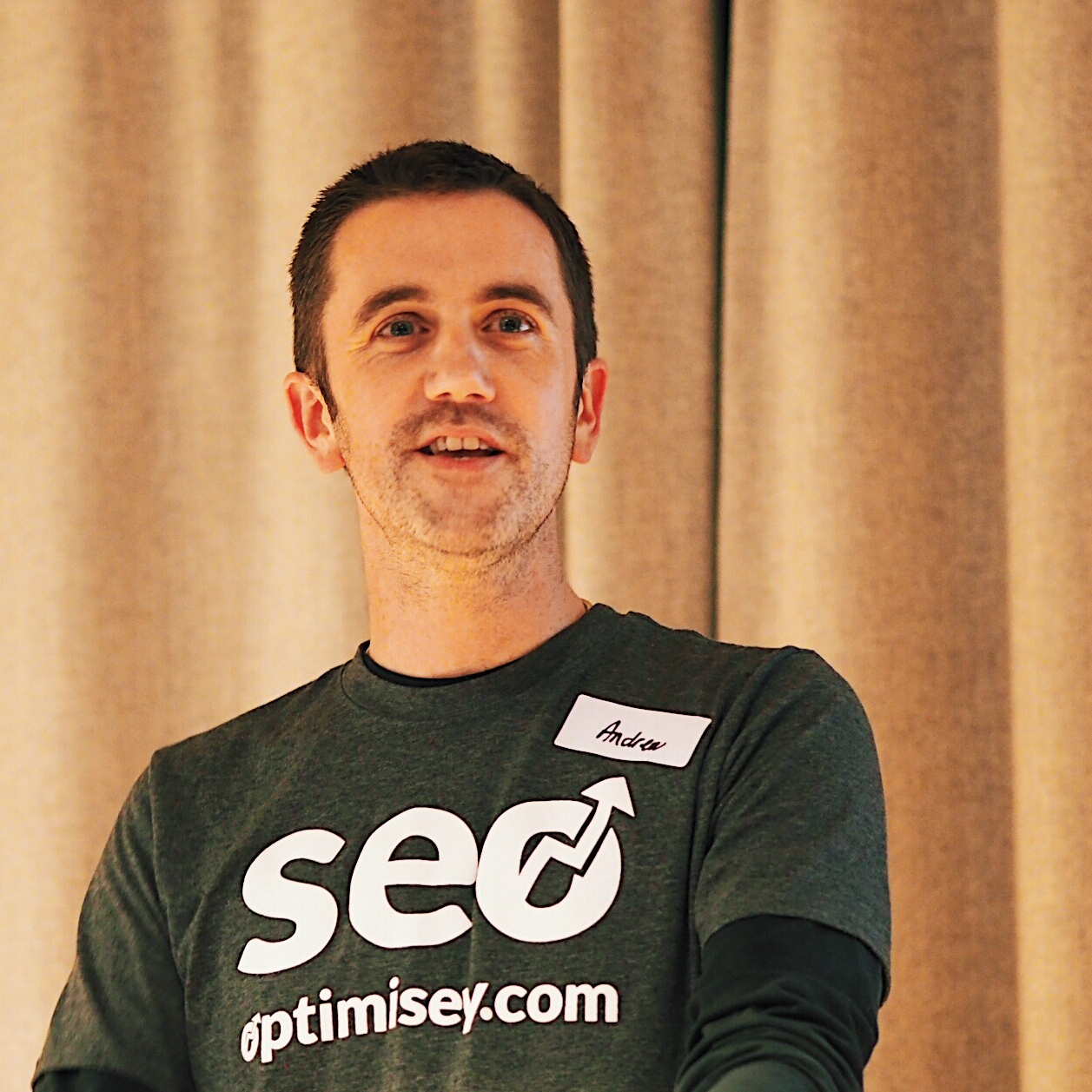
Andrew runs Optimisey, an SEO consultancy based in Cambridge. He’s been working on websites for nearly 20 years, and as well as his SEO work with clients, also runs events to help businesses learn, network and share information about SEO. He loves SEO in all its forms, from the technical to the less technical!


Leave a comment